Solutions: Data Pulse

Bring your energy data into full view

Data Pulse transforms scattered, complex energy data into actionable insights with real-time energy monitoring and visualisations.
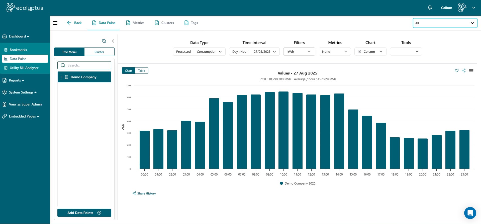
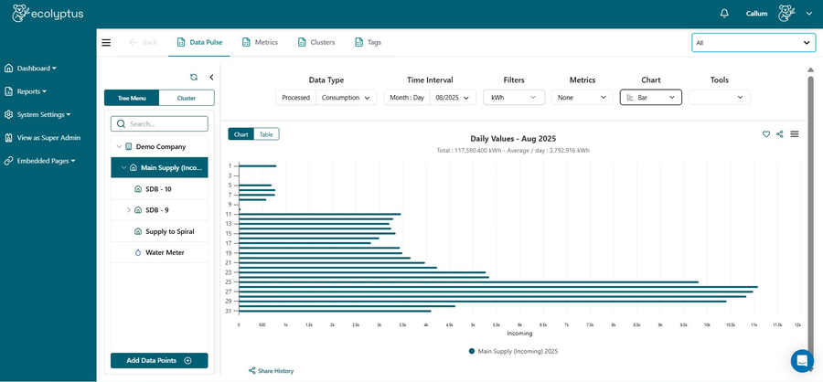
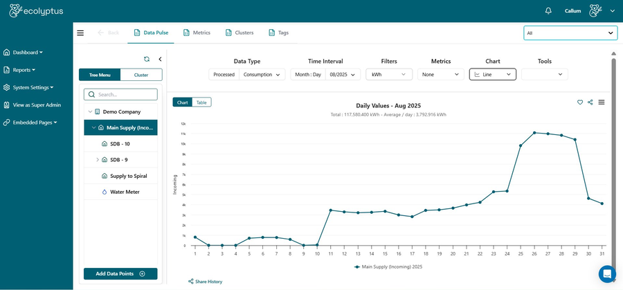
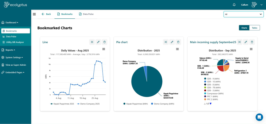
Book a Demo
app.ecolyptus.com/data-pulse
Data Pulse dashboard
Real-time visualisation

Visualize energy consumption

Data Pulse visualises energy usage in real time with a variety of interactive graphs — line, pie, stacked, column, and more. These flexible tools make it easy to spot trends, compare sites, and track performance over time.

LineColumnBarPie
Data Pulse line chart
Data Pulse column chart
Multiple metrics

Metrics that matter

Track the metrics that matter most — kWh usage, carbon emissions, and cost. Switch seamlessly between views to understand energy consumption, environmental impact, and financial performance in one dashboard.

Any time interval

Flexible time intervals

View performance across any interval — hourly, daily, weekly, monthly, yearly, or custom ranges. Zoom in for detail or step back for the bigger picture to monitor trends and track your energy reduction progress over time.

Data Pulse pie chart
Clusters & Tags screenshot
Organisation

Clusters & tags to simplify complexity

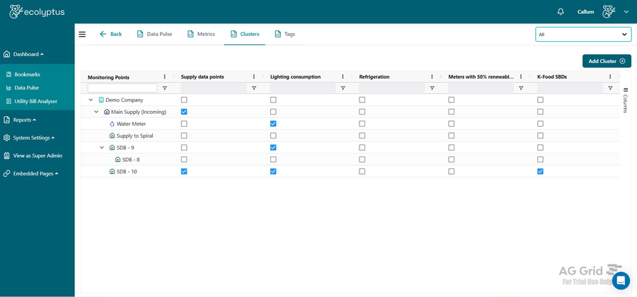
Organise complex, multi-meter installations using flexible clusters and descriptive tags so you can group meters by HVAC, lighting, production, or business units. Apply multiple tags to drill into the exact areas that matter most for your cost-saving and consumption optimisation goals.

Group by systemGroup by zoneMulti-tag filteringNested hierarchies

The business case for real-time energy visibility

Organisations that move from reactive to real-time energy monitoring consistently report faster savings and fewer surprises. Here is what the research shows.

30%
Energy cost reduction
Buildings that implement real-time submetering and analytics achieve up to 30% lower energy costs compared to unmonitored baselines.
Source: Carbon Trust / IEA Energy Efficiency Report
Faster fault detection
Real-time monitoring identifies equipment faults and abnormal consumption patterns up to 6× faster than monthly bill analysis alone.
Source: IPMVP International Performance Measurement Protocol
£0.11
Saved per kWh identified
Every kWh of waste identified through granular data monitoring translates directly to cost avoidance at current UK commercial electricity rates.
Source: Ofgem / BEIS UK electricity pricing data 2024
2.1 yr
Typical payback period
ISO 50001-aligned energy management programmes with real-time data tools show a median payback of under 2.1 years across industrial and commercial sites.
Source: BSI / ISO 50001 Impact Study 2023
40%
Less time reporting
Automated dashboards and visualisations cut manual data collection and report preparation time by 40% for energy managers and sustainability teams.
Source: CIBSE Energy Management Guide 2024
15%
Demand charge savings
Visibility into peak demand patterns enables organisations to shift load and shave peaks, reducing demand charges by an average of 15% annually.
Source: Rocky Mountain Institute: The Economics of Demand Flexibility
Book a Demo